Friday, 16 March 2018

WEEK 6

WORKSHOP:

- The presentation subjects this week didn't appeal to me as they didn't suit my style or go with my main ideas, therefore didn't feel the need to include them or any research into them this week.

PHOTOGRAPHS: 

Photos I've taken -

These photos were originally taken for a different project but I think they could work well for the idea I want to go with which does feature a model as the main subject. 


READING:

The Meaning of Making: Chapter 4 - 
  • 'The early terms used to characterize the internet,
    such as 'virtual reality' and 'cyberculture', underlined
    the notion that this activity is ethereal and not 'real'.'
  • Cyberculture - 'the social conditions brought about by the widespread use of computer networks for communication, entertainment, and business.'  https://en.oxforddictionaries.com/definition/cyberculture
  • Explaining the importance of design, Gauntlett talks about YouTube and how it has grown from being a small website into a big web platform. 
  • Ruskin 'the vivid expression of the intellectual life which has been concerned in their production' - he says that although a smart, well-produced project is nice to get, its not the most important thing.  

WEEK 5

WORKSHOP:


Joshua Davis inspired work using the scatter brush on Illustrator - 

POSTER INSPIRATION:


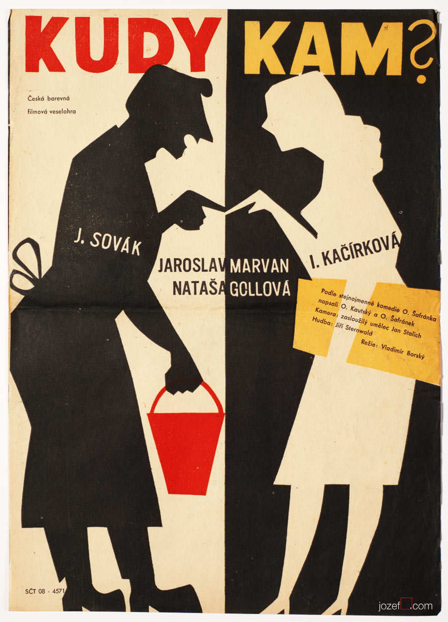
Film poster design from the 50s -

I like the half and half look of the black and white posters, this was an extreme stand out idea especially at this time in the 1950s. America started up the civil rights movement who spoke out about inequality and injustice. The designers of these type of posters realised what would catch peoples attention and intrigue all audiences, which became a popular theme throughout the 50s. To bring my own swing to this idea, I would add a bright pop of colour which also attracts the eye.

Image result for film posters design 50s

Image result for film posters design 50s

PRESENTATIONS :

Otl Aicher -

' The result of several years of work, the graphics were developed on a strict grid system, solely used the typeface Univers and were created from a bright palette developed from the colors of the Bavarian countryside. He was a very proficient typographer and created the Rotis family of typefaces, which include sans-serif, semi-sans, serif and semi-serif iterations. The typefaces were named after the property where he lived and worked from 1972 until his death in 1991.'
http://www.designishistory.com/1960/otl-aicher/


READING:

Graphic Design: The New Basics

Time and Motion
  • Time and motion are important in graphic design work because its a way to represent the movement of our bodies. These two factors go hand in hand as 'motion is a kind of change, and change takes place in time'.
  • It's like reading a book, you read it from left to right therefore looking at something visual you want to read it in flow the same way you read a book. This is the motion of following design work.
  • 'A word or design element can stay still while the environment around it changes.'
  • In film, elements such as composition, colour, scale and other principles are important as they change over time. Motion designers are in charge of this.
  • Cropping an image can show motion and movement, 'an image that is partly cut off appears to be moving into or out of the frame.'
  • 'Animation uses sequences of still images to create the optical illusion of movement.'
Rules and Randomness
  • Designers make rules like magazines designers use grids and typography. 'Rules create a framework for design without determining the end results.'
  • 1920s - Laszlo Moholy–Nagy, Bauhaus artist and designer created a painting by giving a sign painter a set of instructions through a telephone call. 
  • 1960s - Sol LeWitt created drawings based on simple instructions.
  • Reapeat and rotate. 

Friday, 9 March 2018

WEEK 4

READING

Graphic Design: The New Basics

Modularity, Grid, Pattern, Diagram

  • 'A module is a fixed element used within a larger system or structure.'
  • Even with a plain piece of ordinary paper, the book shows you can still create an exciting, dramatic effect. 
  • 'Typography is mostly an act of dividing a limited surface' Willi Baumeister
  • Grids are important to achieve symmetrical and unsymmetrical content. There are different types of grids which I have demonstrated in week 1 and 2's homework, such as page grids, broken grids, calendar grids etc.
  • 'Surface pattern is creating a vibrant discourse'
  • All patterns come from isolated elements (dots), linear elements (stripes) and the criss-crossing elements (grids).  

PRESENTATIONS -

  • 90s Club Culture, The Designers Republic
  • Joshua Davis -
See the source image

HOMEWORK

1) One of the posters I find inspiring by its colours and shapes. I also quite like the typography but I think for my project I want bold text.


Below I tried copying an album cover by Peter Saville, I think it turned out alright but I could improve on adding the shading and text. I personally don't like the colours as they are quite clashing and a bit uncomfortable to look at. 

Image result for peter saville


2) Practising on Illustrator:

WEEK 10

PROJECT DEVELOPMENT: Throughout the following projects of accessories, I continued the black and white theme contrasting with yellow and ...